Even today, with AI, robots, and the end of the world upon us (kidding, I hope), the importance of responsive design has only increased. More and more people are accessing websites and applications on a variety of devices, from smartphones and tablets to laptops and desktops. It is no longer optional for your website to be optimized for all screen sizes.
Not only is responsive design important for user experience, but it’s also critical for search engine optimization (SEO). Google’s mobile-first indexing (which became a hot topic almost 10 friggin years ago) means that websites not optimized for mobile devices will likely see a drop in their search engine rankings.
Recognize that your website is the hub of your front-facing communications efforts. It’s the central repository of your content marketing, and it is the place where your clients, members, and fans look to interact with you directly. The user experience must be seamless or you are making a bad impression.
But first, what exactly is Responsive Design?
What is Responsive Design?
Here is a more recent definition of responsive design from Mozilla, makers of the Firefox browser…
“Responsive Web Design (RWD) is a Web development concept focusing on making sites look and behave optimally on all personal computing devices, from desktop to mobile.” – Mozilla
Responsive design employs the use of flexible grids and layouts allowing images and content to resize based on the size and orientation of the screen. So, we’re all on the same page, here are some useful terms to know when talking about responsive design.
- Mobile First – prioritizing mobile layouts before creating tablet and desktop versions.
- Breakpoints – where the layout changes, typically occur at mobile (320px-480px), tablet (768px-1024px), and desktop (1024px and above) resolutions.
- Target Size – the size of links or calls to action, which should be around 40px in both height and width for mobile devices.
- Progressive Enhancement – developing core content initially and gradually incorporating additional presentation elements as the layout expands at specific breakpoints.
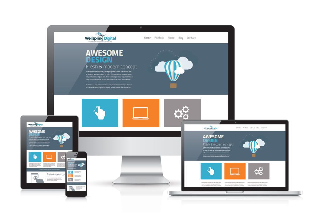
Responsive design does not mean multiple websites for multiple devices, it means one website that is rearranged automatically for optimal user experience on:
- Desktop or laptop
- iPad or tablet user
- Mobile devises
Adjusting your design to be responsive means that no matter what device your audience is on, the user gets the same content delivered in an experience optimized for that device. It’s important to note that responsive web design is not just about making your site mobile friendly, it’s about providing a seamless user experience no matter the device.
Of course, there is a caveat: more websites are developed to be viewable on modern browsers and devices. So, no, it’s not going to look ideal on an iPhone 4. Get with the times, people!
Voice Search and Responsive Design
The growing popularity of voice search and smart speakers has added another layer of complexity to web design. With more people using voice assistants like Siri, Alexa, and Google Assistant to access information, it’s crucial that your website is designed with these devices in mind.
This means, as someone is asking their phone something, the voice assistant will ultimately direct them to a website or piece of information. Those destinations must be optimized for all users or the positive user experience ends right there!
Responsive design isn’t just about making your website look good on different devices, it’s about creating a seamless user experience across all platforms. No matter what platform, browser, and location, users should be able to navigate and interact with your website without any issues.
Good News about Responsive Design
The good news is that most modern content management systems, like WordPress and others, have made implementing responsive design an easy process. I would be surprised if there were still any WordPress themes out there that did not include responsive breakpoints. In other words, responsive code tells the browser to rearrange the images and content based on the device where it is being viewed.
So far, I am talking mainly about the code of the website. But it’s also important to think about the content, images, and video for all user scenarios
Responsive Content, Images, and Video
There are few simple things that you can do to ensure that your site loads fast and that the content, images, and video are optimized for any user. Whether you are working on your laptop in a coffee shop or riding the bus while surfing the web on your phone, you are most likely going to suffer from slow internet speeds.
Build your website using these tactics…
Responsive Content
Your written content can also be responsive. I’m referring to the art of writing for any audience. Your content can work well for any audience. Content for mobile users means they can quickly and easily scan for important points.
- Headline – the attention grabber that gets the click
- Lead – the first sentence or two that reels them in
- Body – the meat that keeps them engaged
- Conclusion – reinforces the main points and gets the click or share
The user needs to be able to get the point of your content within a sentence or two. Use things like article summaries at the top of the article that lets them know what your content is about. Some refer to this as TLDR or too long, didn’t read.
Responsive Images
Regardless of whether it’s for a mobile or desktop user, your images should be as optimized as possible. There are a ton of free tool that allow you to reduce the size of the image while not degrading its quality.
For example, I took this image of my daughter back when she was a wee lass…


One of these is significantly a significantly smaller file size. Can you guess which one? The one on the left is 500k. The one on the right is 25k. Those differences add up big time and can mean the difference between and fast website and someone yelling “COME ON ALREADY!” at their phone while your slow website loads…
Responsive Video
Do we really need to tell you about the importance of using YouTube or Vimeo for your website videos? Yeah? Ok, fine!
You will be hard-pressed to find a legitimate reason for loading your native video file directly on your website. It will load much slower and hog all of your website space resources. Just bad form.
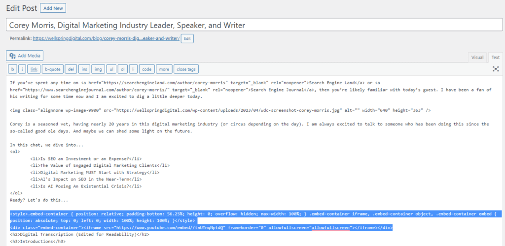
Instead, use a video platform like YouTube or Vimeo, grab the embed code…
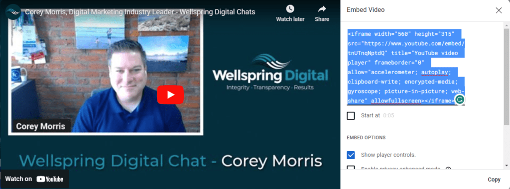
And then plunk it into the code of the page or post where you want to show…
If you need help, contact your website support team and ask them (no demand) to show you how to do this. The benefits are clear and make this a worthwhile exercise…
- Files not stored on your server
- Simple to post and embed from your YouTube or Vimeo channel
- The videos are automatically optimized for all users/devices
- They stream from cloud, meaning they will load from the nearest server to provide the fastest performance
- There are obvious SEO and content marketing benefits to using YouTube as it is the 2nd most popular search and is owned by Google.
User Experience Is No Joke!
Websites should always load quickly and be easy to use no matter where and on what device it’s being viewed. Responsive design is an important element of any modern website.
Don’t take responsive design for granted. Test your phone on multiple devices. How does it look? Perform?
Do your due diligence and make certain that your site is ready for any user, anywhere, anytime!
Do you need help with your website’s coding or speed? Let us know!