If you’re a Land’s End or Amazon online shopper, you undoubtedly know the amazing ability both sites have to “pull you back in” and keep you buying over and over.
How do these and other top-performing e-commerce sites improve conversions?
Here are some fundamentals to keep in mind when planning your e-commerce site:
Reduce Product Page Abandonment
Does your e-commerce business have a strategy for reducing shopping cart abandonment? Great! Now take the next step and reduce product page abandonment.
Product page abandonment means that a visitor has gone to at least one product page on your website, but then leaves the site without putting a product in their shopping cart. As e-commerce marketing automation gets more sophisticated, companies are starting to pay more attention to product page abandonment.
Here are five tactics you can use to reduce product page abandonment…
1. Provide Enough Product Information
Have you ever left a product page because you didn’t get enough information? I sure have. Maybe you want to know the fabric content or care instructions for a piece of clothing, or the size of a sofa so you know whether it will fit in your living room. Maybe you want to see reviews from other buyers.
In addition to a compelling product overview, which helps create an emotional feeling about the product, you should also think through all the information that a shopper might want.
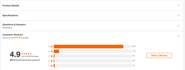
The problem is that some shoppers want tons of detail, while others don’t care and feel overwhelmed if they see a lot of type on a page. One way to keep both types happy is to use tabs to display product information. This way, those who need more details can click through to the “Specifications” or “Reviews” tab, while those who don’t need that much data can just read the product overview.
2. Don’t Forget About The Visuals
Visuals can make any page more attractive, including product pages.
Photos and videos are just as important as words in providing product information. Recently, I was shopping for curtains online. Many sites were frustrating because they didn’t provide the ability to zoom in on the curtain fabric to see weaves or patterns—a key differentiator in selection.
Include photos of products from all relevant angles, against a white background as well as in use, and give viewers the ability to enlarge or zoom. For instance, if you sell apparel online, showing it both laid flat and on a model, as well as front and back, gives viewers a clearer idea of fit and appearance.
Products such as apparel or shoes can benefit from videos that give a sense of how the fabric hangs or how flexible the shoe is. Video marketing is one of the fastest-growing e-commerce trends, so start looking at incorporating videos in your conversion optimization strategy.
3. Include Calls to Action on Each Product Page
For best results, calls to action such as “Add to Cart” should be prominently displayed near the product price. The desired action should get customers one step closer to checking out.
Don’t make them think or leave them confused. Calls to action should be clear, obvious, and enticing!
4. Be Consistent
If at all possible, provide consistent levels of product information on all product pages. This will create familiarity: your customers will know where to look for the information they need.
Some manufacturers don’t provide as much detail as others. You will probably find that those products don’t sell as well. Tracking this kind of information and sharing it with the wholesaler or manufacturer might inspire them to provide more information.
If necessary, you may want to measure the item yourself or take other steps to get the information you need.
5. Use Marketing Automation
Marketing automation is no longer something that’s only available to e-commerce giants. It can now be used by anyone. Send out reminder emails to reduce shopping cart abandonment, alert your past customers of similar products they may be interested in, send gift ideas, and give away special deals for birthdays and big holidays.
Whether you can do this depends on the abilities of your shopping cart and e-commerce software—as well as how well your customers deal with the “Big Brother factor” of getting emails about products they’ve only looked at. Still, this is a trend worth keeping an eye on.
Additionally, there are quite a few email marketing services that integrate well with most e-commerce content management systems allowing you to do what your e-commerce solution cannot.
Market and Design for the Long Term
Top-converting websites focus on creating customers for life—not making a quick sale. The customer experience is key to getting these customers to come back again and again.
All of the top 10 sites make it super simple, convenient, and safe for shoppers to buy. To do so, they provide options such as…
- shipping to a different address than the cardholder’s
- the ability to review orders before placing them
- indicators of checkout progress
- a toll-free phone number on the home page to get help
User experience is crucial for conversions, so don’t neglect this step!
Make it Easy to Shop and Browse
To improve conversion, make the online experience as pleasant as browsing a brick-and-mortar store. For example, successful e-commerce websites frequently use pop-up shopping carts. Instead of taking customers to the cart when they add something to it, whenever customers put an item in their cart, a pop-up cart overlays on top of the page.
Just as in a store, users can add items to their pile without having to leave the shopping experience. Online user reviews help customers make decisions without being able to physically touch the merchandise, as do various photo angles and options. And “bestseller” or “top-rated” sidebars serve the same function as end caps or store displays in calling out hot products.
Use Remarketing
Top e-commerce sites boost conversion by using remarketing campaigns to attract previous visitors and customers. One way they improve conversion is by grabbing email addresses early.
Many e-commerce sites force users to create an account to buy. While this might seem counterintuitive, the process eliminates users who aren’t planning to buy anyway. The email address will have to be captured at some point, so why not capture it early?
In addition, almost all of the sites include email signups on the home page to get marketing messages or newsletters. Want to grab the email and boost conversion right away? Offer a site visitor a percentage off or a free shipping code if they sign up to get emails from you—then send the email immediately. With the code in hand, they’re more likely to buy then and there.
Analyze What Your Competitors Are Doing
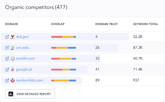
Keeping an eye on your competitors will let you discover even more conversion optimization tactics. SE Ranking competitive research tools provide you with lots of information on what your competitors are prioritizing, which pages of theirs perform best, and how they capture clicks and conversions from their organic positions.
By trying these tactics and running marketing experiments on a regular basis, you can get closer to the top 10 companies’ conversion rates of 22.8 percent over six months.
Need help with your e-commerce website, conversion optimization, remarketing campaigns, or marketing automation? Let’s chat!

