Working on UX improvement should be an ongoing endeavor. Technology changes frequently and users become adept at navigating a site’s features. Adding fresh insights and functions keeps visitors engaged so they return to the site frequently. Finding the right combination of efforts to improve user experience (UX) and market the advantages to customers helps increase the amount of spending amongst current clients and attract new ones.
What Are UX Strategies?
Nielsen Norman Group defines a UX strategy as a series of actions meant to improve user experience over time. Parts of any strategy must include a vision, goals, and a path to get there.
Figure out what pain point impact a site by testing usability. Start with a walkthrough of the buyer’s journey and ensure everything functions as it should. Links should go where expected. User intent must be a deciding factor in what’s included and left out.
Conduct usability testing through data mining. For example, form a team of test subjects and have them add a product to the cart and go through the checkout process to identify issues or areas for improvement. Before a brand can fix UX problems, it must identify them.
The approach companies use may vary but each strategy should have those three components to be successful. Rather than look at general concepts, it’s smart to break down specific ideas to achieve success and pick and choose from the ones that drive revenue. Here are some of the top UX strategies to boost sales quickly and meet customer expectations.
1. Simplify Checkout
If the checkout process becomes too complex, users may bounce away from the site for one that’s easier to navigate. Study the checkout steps and nix any not needed. The fewer steps, the better.
Utilize third-party payment options such as PayPal and Google to allow users to pay without inputting a bunch of information. One-click solutions, such as the ones Amazon offers, let repeat users reorder easily and increase sales.
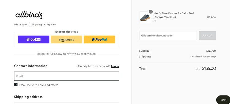
Source: https://www.allbirds.com
Allbirds offers a simple checkout option. Users can select “Express Checkout” and pay with ShopPay, Amazon Pay, or PayPal. Because the user typically already has an account with these companies, they can click and pay, skipping the steps of filling in user information and completing the sale quickly.
2. Study Competitor Offers
Spend a few hours looking closely at competitor websites. What offers do they provide to users and how are they presented? UX is about how easy it is for shoppers to find what they need. Are the competitors doing anything differently?
Also, look at popups and information in the header on each site. How easy is it to add a sale item to the shopping cart? Is there a popup that lets the user add multiple of an item? One way to increase sales is to sell more of the same product to the same people. Special offers, such as buy two get one free, or spend a certain amount and get a percent off encourage higher amounts on orders.
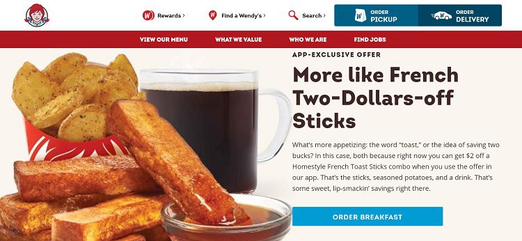
Source: https://www.wendys.com
Wendy’s is known for going after competitors and while that approach isn’t always best, the snarky and sometimes subtle ways they do it works well for their customer base. Note how they word their subheading to indicate they have the best French toast sticks. They don’t directly call out any other fast food brand, but those who enjoy French toast sticks know what they mean.
They add an excellent way to easily order breakfast from them by adding a bold CTA button, improving the UX of their site over similar ones.
3. Improve Mobile Experience
The number of mobile users continues to grow. Approximately 90% of smartphone users browse online with their mobile devices. As phones and connections become faster, the number should grow.
Increase sales by making a site more mobile-friendly and attract those users who might otherwise leave a site not optimized to their smaller screens.
Think about the way a user interacts with a mobile device screen. Where are their thumbs placed and how does that relate to call to action (CTA) buttons the person might tap while browsing a site?
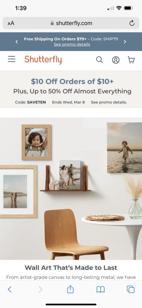
Source: https://www.shutterfly.com
Shutterfly’s mobile design is very intuitive and sizes for nearly any smaller screen. They also offer an app for those who prefer the convenience of shopping with that method.
If you want your mobile site to function properly, try some of the popular mobile testing tools out there, such as UserTesting.com, the Mobile-Friendly Test via your Google Search Console, or Applause. There are many others, but these three are quite intuitive and easy for beginners. Test apps via Exam, UserZoom, and Testbirds.
4. Improve Search Functions
When people come to a website, they often have an idea of what they want to buy. Ensuring the search feature is as accurate as possible increases the chances the person will see what they want and make a purchase.
One way to improve search functions is through keywords. Think through what people are most likely to type in when searching for something. User intent matters. A tee could mean a T-shirt or a golf tee. Think through the most likely results for the search on a website and code them accordingly.
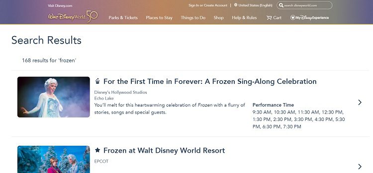
Source: https://disneyworld.disney.go.com/search
Disney World offers an excellent example of how to create a highly functioning search feature and incorporate it into your site for user-friendliness. Note the placement. The search bar appears at the top of each page just above the navigation.
Type in a term, such as “Frozen” and the responses are highly intuitive to what user intent likely is. For example, someone searching for the keyword “frozen” on the Disney World page likely wants to know what events and rides are available at the parks.
Pay Attention to the Finer Details
Little things make a huge difference, such as product descriptions. Shopping cart and product page abandonment are serious issues for most online retailers. People can’t feel the item or look at it in person when they’re shopping digitally. It’s vital to write strong product descriptions so the buyer can make informed decisions.
Product descriptions should include details on size, color, weight, and any features the product has. If there is something unique about the item, list the difference in detail. Include images showing the item from every possible angle. Make the user feel as though they are in the same room as the product viewing it.
Test the Shopping Funnel
Businesses can do everything right in their product descriptions, CTAs, and the aesthetic of their site and lose the user because of an error or two. Take the time to test every moment of the buyer’s journey.
The best ways to test the buyer’s journey are with tools such as customer journey mapping tools, consumer surveys, walking through the site step-by-step as a consumer would, and considering which stage the buyer is in along the way, such as awareness or decision stages.
Where does the user go first? What’s next? Go through the site step-by-step as though the buyer, making sure everything works as it should. Test the shopping cart through the purchase.
What happens after the user places the order? Is a confirmation given? Do emails send out properly? Should anything be changed? Even little things can make a huge difference in word-of-mouth referrals and repeat orders.
What Else Can You Do to Boost Sales with UX?
User experience starts with a website design but also includes the things that make a customer feel valued as an individual. A short, handwritten note included in the order can show them the company appreciates their business. Offering a blog explaining how to overcome various pain points the customer is likely to have can take the business to a new level.
If a brand puts the user at the center of everything they do, it’ll have much better success with UX and happy customers.
About the Author
Eleanor Hecks is the editor-in-chief of Designerly. She’s also a web design consultant with a focus on user experience and style guides. She lives in Philadelphia with her husband and Goldendoodles, Bear, and Lucy. Connect with her about marketing, design, and/or tea on LinkedIn.